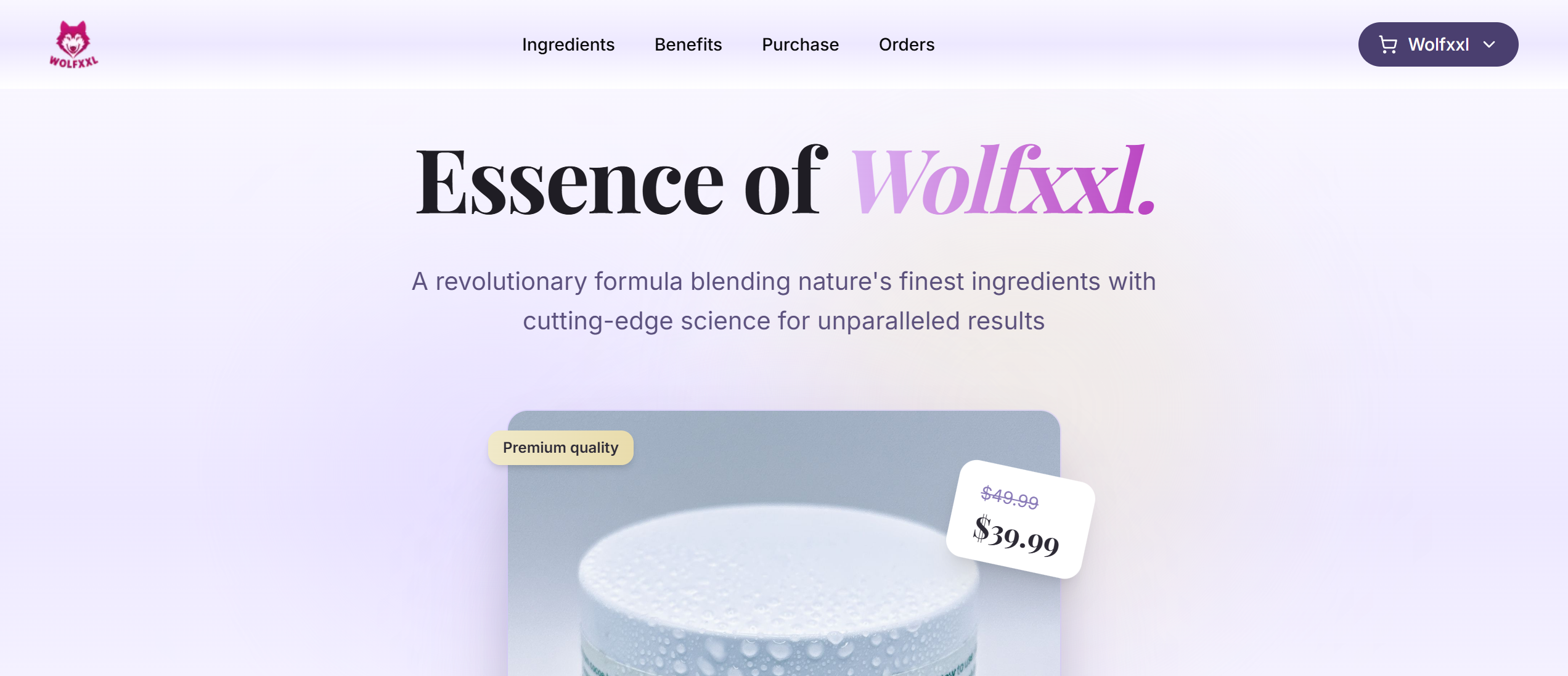
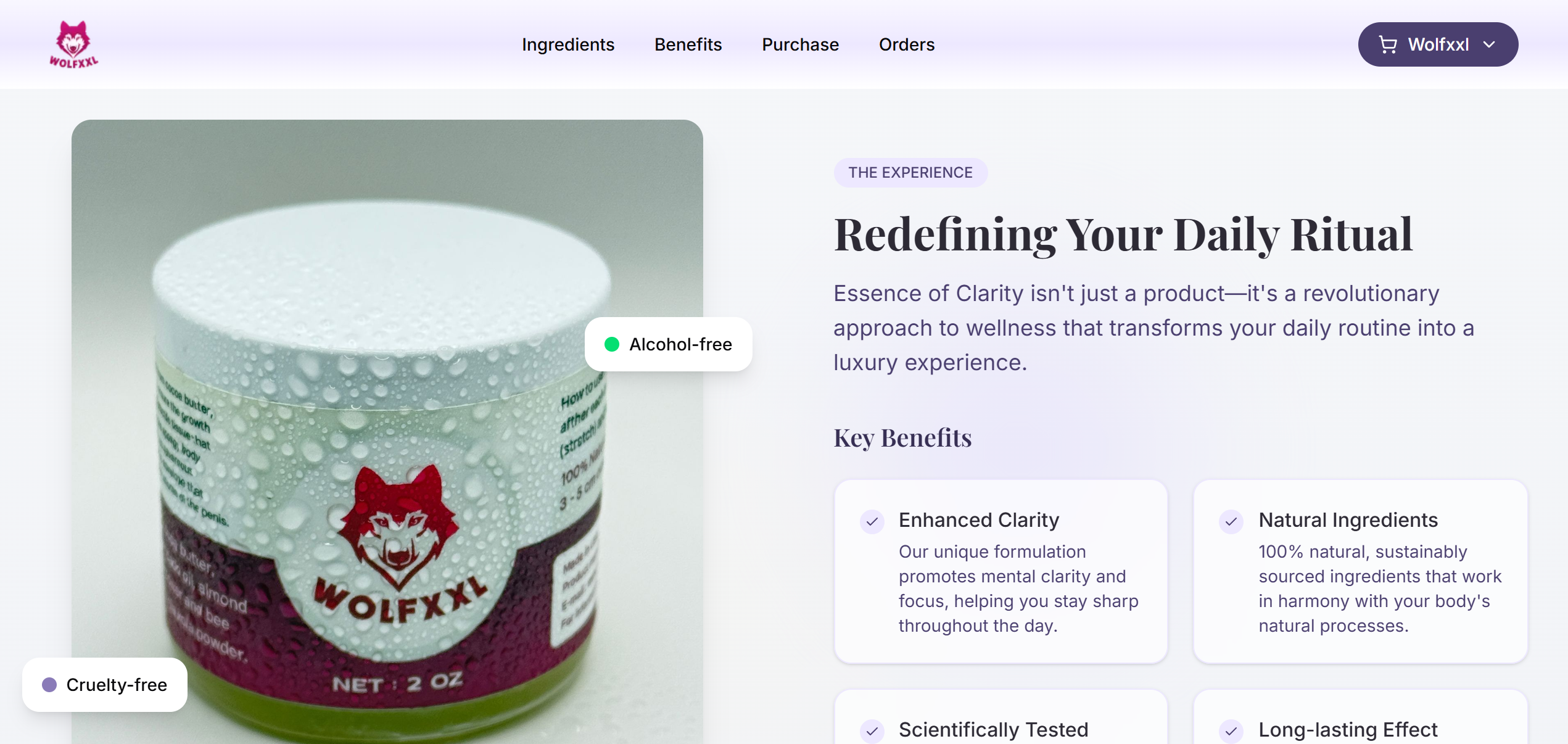
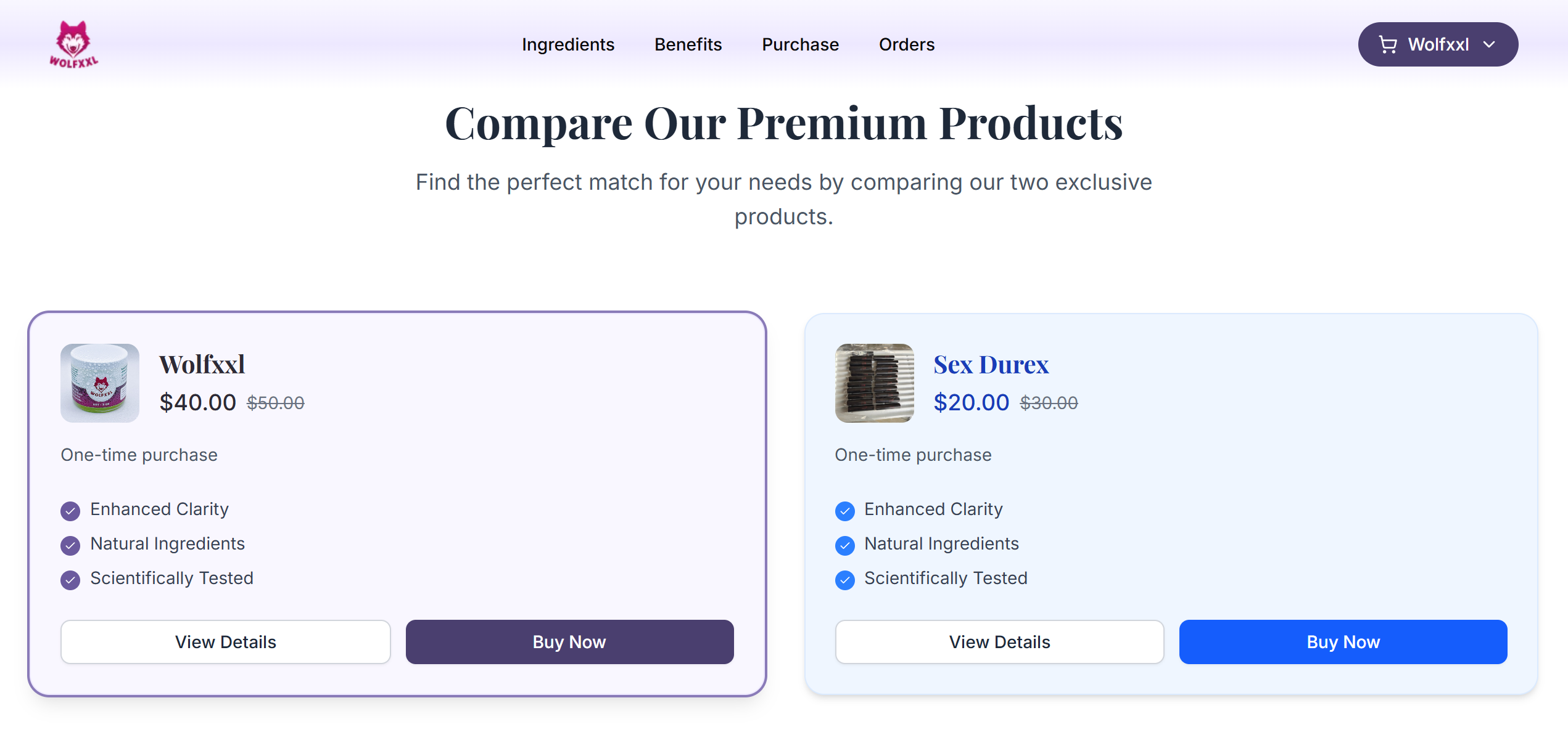
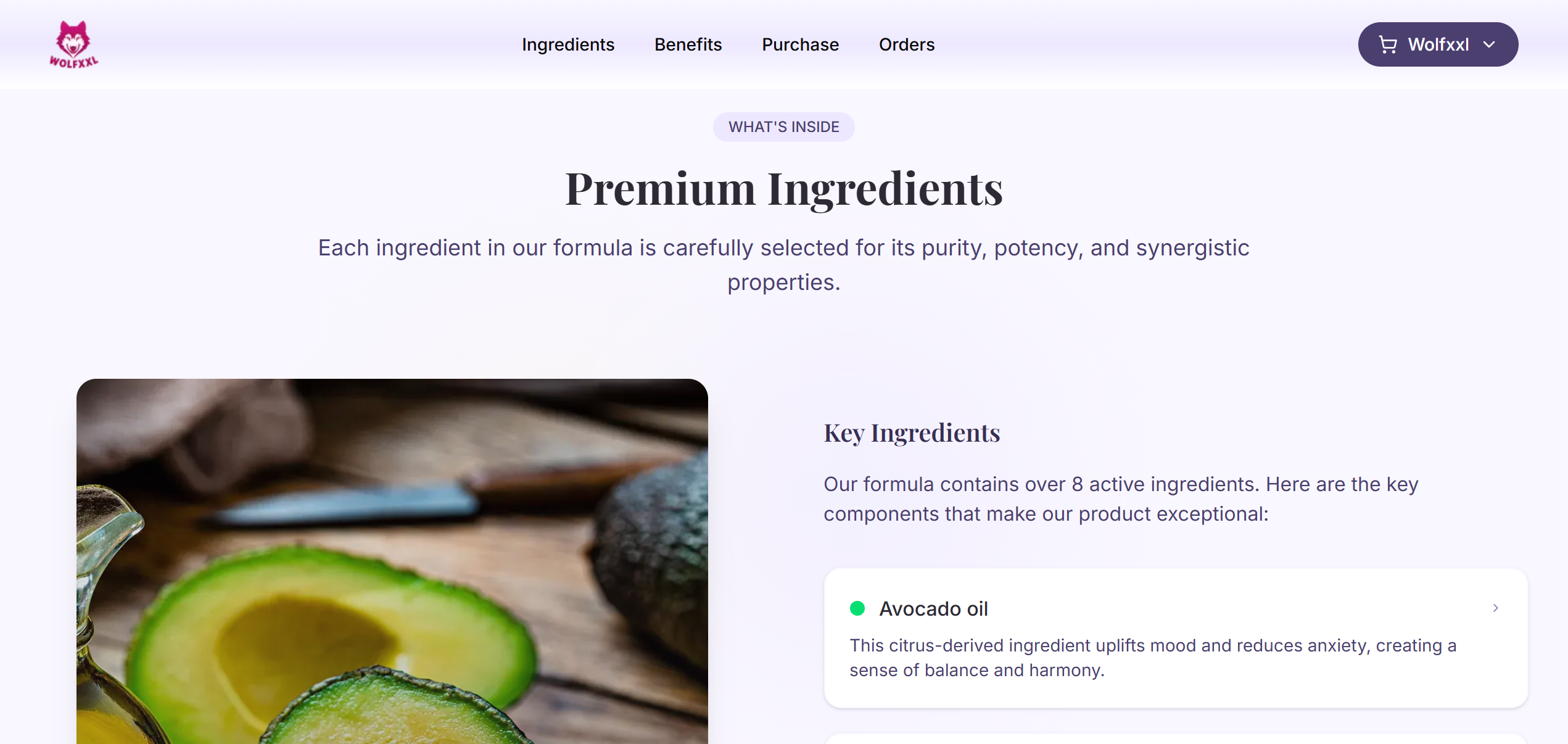
Project

Wolfxxl

Screenshot of the Home screen in the Lemon Squeezy app. To the left is a menu showing the different areas of the app, and to the center and right is a dashboard with charts relating to the Lemon Squeezy store being demoed here. Charts can be filtered by date. For each chart, three’s a purple line for the selected period and a pink line for the previous period. Above each chart is the current value for the shown metric and below, in grey, is the metric of the previous period. A badge next to the metric shows the percentage change in green for a positive change and red for a negative change. Hovering the chart shows the metrics at that specific time in a little card.
Technologies
Next js, Tailwind css
Date
Go to website

Wolfxxl

Wolfxxl Website

Get your full potential with Wolfxxl

Screenshot of the login screen for the Lemon Squeezy app. The screen is split in two, 50/50. To the left is a login form and buttons to sign in with Google and Twitter. To the right is a colorful background with the familiar Lemon Squeezy color patterns of drops and circles. In the middle of the section is a testimonial from a Lemon Squeezy customer.
Benefits
Screenshot of the login screen for the Lemon Squeezy app. The screen is split in two, 50/50. To the left is a login form and buttons to sign in with Google and Twitter. To the right is a colorful background with the familiar Lemon Squeezy color patterns of drops and circles. In the middle of the section is a testimonial from a Lemon Squeezy customer.
Products
Screenshot of the login screen for the Lemon Squeezy app. The screen is split in two, 50/50. To the left is a login form and buttons to sign in with Google and Twitter. To the right is a colorful background with the familiar Lemon Squeezy color patterns of drops and circles. In the middle of the section is a testimonial from a Lemon Squeezy customer.
Ingredients